Eye tracking study of Swedish home electronics web sites
By Sofie Kaiser, November 2008
Competition is increasing amongst the large home electronics stores as the economy is slowing down. Several smaller companies have recently closed down or gone bankrupt. According to a survey by Capgemini, consumers won’t necessarily purchase less, but ‘smarter’ (shopping on the internet allows for much easier price comparison and consumers can be more selective in their product purchases).
We were interested to see how some of the web sites of Sweden’s largest home electronics suppliers stood up given the prospect of tougher times. As the home page is the first thing that customers meet, it is likely that suppliers have put particular effort into its design and content – particularly with respect to how products are promoted there. We therefore decided to conduct an eye tracking study to see what users looked at (or not) on the home pages of 3 major suppliers.
We sought answers to the following:
- What caught user attention (what did they focus on)?
- How does the composition of the home page (graphical elements, texts, buttons) relate to how users look through the page?
I vår studie har vi testat startsidorna på följande företag:
- Elgiganten
- Expert
- Onoff
30 test participants (in the age range 19 to 63, with an even sex distribution) were given the task of finding a present for a family member. Participants attempted the same task on all three web sites (the order was randomized).
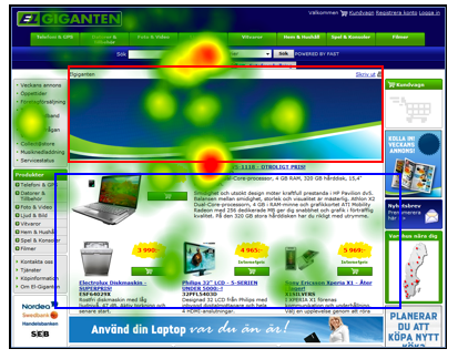
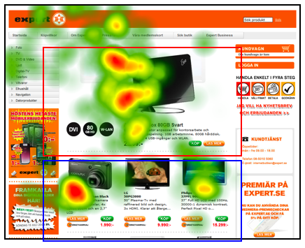
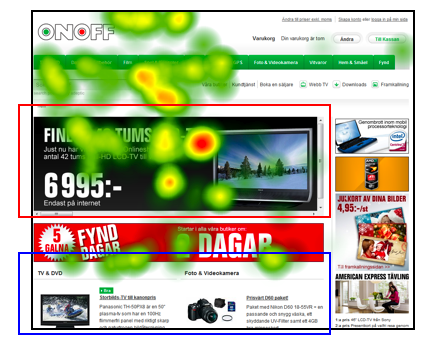
The pictures below show 3 “heat maps” which illustrate what users first looked at when they saw the home page – the more intense the red colour is, the more users focused on that area.
Elgiganten.se: All apart from two participants looked at the large product banner in the upper middle area (red rectangle outline – though in this picture the products had not yet loaded up). 74% of participants looked atht eproducts in the lower middle area (blue rectangle outline).

Expert.se: All test participants looked at the product that was presented in the upper middle area (red rectangle outline). All apart from one also looked at the other products presented in the lower middle area (blue rectangle outline).

Onoff.se: All looked at the product in the upper middle area (red rectangle outline), though very few (20%) saw the there were more products presented lower down on the home page (blue rectangle outline) – most of these were below the scroll line for the resolution we were testing at (1024 x 768).

In this article we’ve shown just a few results from the study, though even these indicate how important the design of a home page can be. What users first look at when they come to a web site can be extremely important to know, especially as they often don’t stay there very long.
Despite many apparent similiarities in the overall layout of such web sites, analysis of eye tracking data can provide objective data about how small design and layout differences can have a big impact on user behaviour.
Did you find this editorial interesting?
You might like to read some of our other editorials.
Please send us an email if you have any comments or suggestions!